Hands-On Data Visualization with Python: Seaborn Scatter Plots
Written on
Chapter 1: Understanding Scatter Plots
A scatter plot is a graphical representation that illustrates the correlation between two continuous numerical datasets. For instance, it can depict the connection between individuals' heights and weights or their salaries and years of work experience. In this guide, we will utilize the Python Seaborn library to create a scatter plot that reveals the relationship between salary and years of professional experience.
Prerequisite Libraries
To follow along, make sure you have the following libraries installed:
You can access the complete source code for this tutorial on my GitHub repository. Feel free to download it (Scatter-Plot.ipynb) to help you follow along.
Building a Scatter Plot with Seaborn
- Importing Libraries
We will begin by importing the necessary libraries into our Python environment.
import pandas as pd
import seaborn as sns
import matplotlib.pyplot as plt
In addition to Seaborn, we will also require Pandas and Matplotlib for this tutorial. Understanding Pandas is crucial as it integrates seamlessly with Seaborn.
- Loading Data
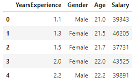
Next, we will load salary data from a CSV file and display a preview of the records.
df = pd.read_csv("salary_data.csv")
print(df.head())
This dataset comprises details on years of experience, gender, age, and salary.
- Creating a Basic Scatter Plot
Now, let's generate our first scatter plot using the Seaborn scatterplot method.
sns.scatterplot(x='YearsExperience', y='Salary', data=df)
plt.show()
This plot requires only three parameters: the x-axis values, the y-axis values, and the dataset. We have set the DataFrame, df, as our data source and assigned the "YearsExperience" and "Salary" columns to the x and y axes, respectively.
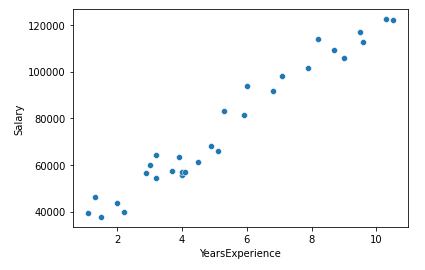
From the scatter plot, we can observe a positive correlation between salary and years of experience.
- Incorporating the Hue Parameter
Next, we will add a hue parameter to our scatter plot to differentiate between subsets of data, such as male and female.
sns.scatterplot(x='YearsExperience', y='Salary', hue='Gender', data=df)
plt.show()
Here, we have set the "Gender" column as the value for the hue parameter.
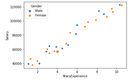
The scatter plot now displays two distinct data groups, colored in blue for males and orange for females.
- Adding a Size Parameter
We can also introduce a size parameter to indicate the size of the data points based on another dimension.
sns.scatterplot(x='YearsExperience', y='Salary', size='YearsExperience', data=df)
plt.show()
Here, we set the "YearsExperience" column as the size parameter.
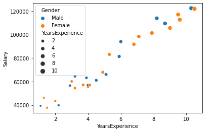
The size of the data points now varies according to the number of years of experience, with larger points reflecting more years.
- Adjusting the Figure Size
We have nearly completed our scatter plot, but the default figure size may be too small for optimal visualization. Let's adjust the figure dimensions.
plt.figure(figsize=(12, 8))
sns.scatterplot(x='YearsExperience', y='Salary', data=df)
plt.show()
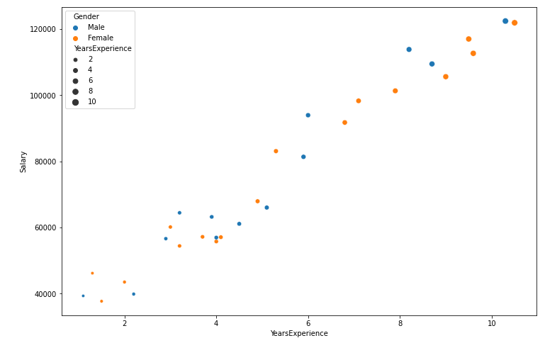
The enlarged figure size allows for clearer distribution visualization of the data points.
- Setting a Title
Finally, we will add a title to our scatter plot.
plt.title("Salary vs Years of Experience")
plt.show()
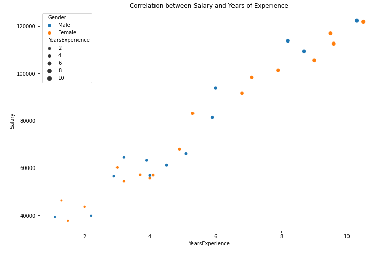
We have successfully completed a scatter plot with an appropriate title and legends!
Afterword
Scatter plots are particularly valuable for examining the relationships between two continuous numerical datasets. Seaborn provides features that allow us to enhance our visualizations by adding hue and size dimensions to our plots, thereby enabling us to analyze data from multiple perspectives within a 2D framework.
Video Tutorials for Further Learning
To deepen your understanding of data visualization in Python, check out the following video tutorials:
The first video, "Seaborn Python for Beginners - Data Visualization Hands-on Lab," offers practical insights into using Seaborn for data visualization.
The second video, "Python Data Visualization Tutorial | Color, Marker and Size!" provides further exploration of customizing visualizations in Python.
Subscribe to Medium
If you enjoyed this article and wish to read more from me or other authors, consider subscribing to Medium. Your subscription supports me in creating more content that benefits the community.