Elevating Design: 7 Insights Inspired by Apple’s Aesthetic
Written on
Chapter 1: Apple as a Design Academy
Apple serves as an exceptional learning platform for design enthusiasts. To truly benefit from its offerings, one must:
- Shift from a consumer mindset to a designer's perspective.
- Acknowledge the pivotal role of designers in Apple’s success.
A hard truth is that Apple’s identity hinges on its design philosophy. While many companies perceive design merely as an enhancement, Apple sees it as integral to functionality. This subtle yet profound shift transforms every individual—whether an engineer or an accountant—into a designer, making each project a crafted experience. This mindset is why Apple’s devices often exhibit superior internal aesthetics compared to their competitors’ outward appearances.
Section 1.1: Merging Text and Visuals
A common pitfall for brands is treating text and design as separate entities. Apple, however, excels in creating a unified narrative. Their designs showcase an effortless blend of typography and imagery, resulting in a cohesive storytelling experience.

Section 1.2: Guiding the Eye
A former Apple designer shared that effective designs guide eye movement. Designers often focus too much on their creations without considering the viewer’s journey. Dynamic designs engage the audience's gaze, creating a zig-zag pattern that directs attention smoothly.
Chapter 2: Focal Points and Emphasis
Section 2.1: Breaking the Pattern
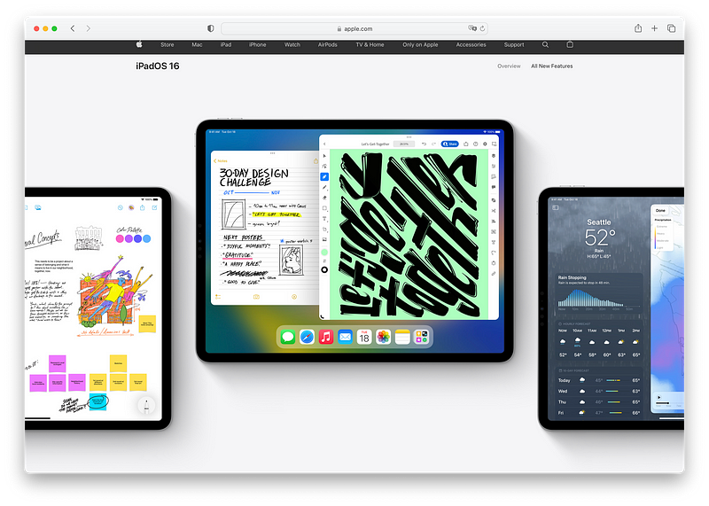
To capture attention, breaking the visual pattern is essential. By creating a clear focal point, as Apple does with its iPad displays, designs can effectively lead the viewer's gaze.

Section 2.2: Typography Matters
Using all caps in text can hinder readability, a common mistake in modern design. Apple avoids this by employing lowercase and incorporating punctuation, which lends a more conversational tone to titles.
Section 2.3: The Power of Opacity
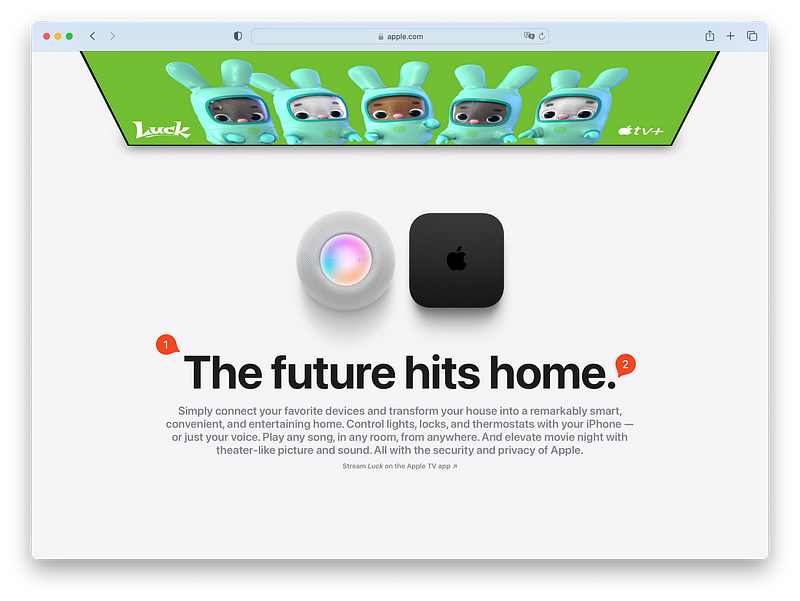
Adjusting opacity can effectively emphasize key text elements. For instance, setting background text to 50% opacity while highlighting critical words at full opacity helps guide attention and underscores importance.
Section 2.4: Human Connection
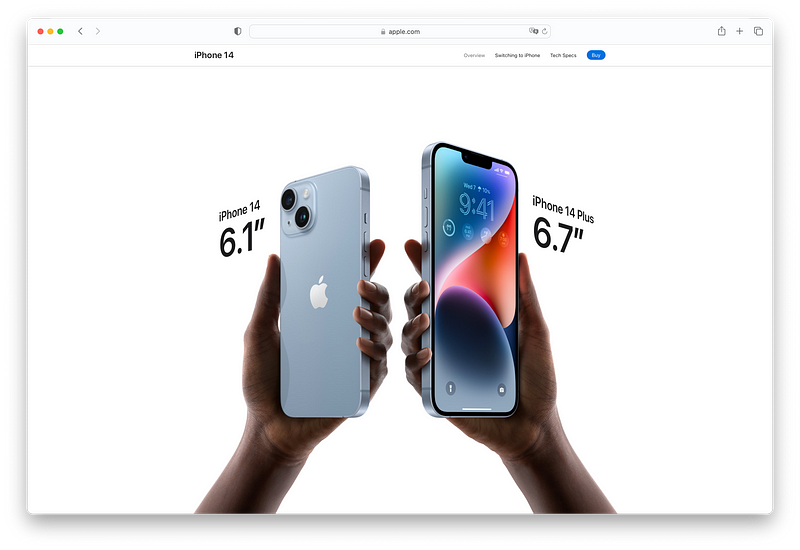
Incorporating hands in product imagery brings life to otherwise static objects. This approach not only enhances relatability but also showcases diversity, enriching the viewer's connection to the product.
Section 2.5: Color Balance
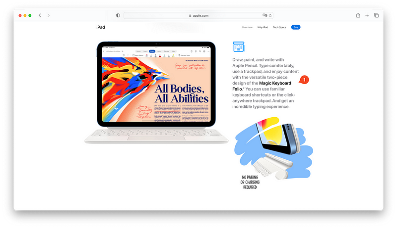
Apple employs color with intention, ensuring that when it is used, it complements rather than overwhelms. Each hue is carefully considered, creating a harmonious aesthetic that feels unified.

In conclusion, beauty lies in simplicity, a principle that resonates through Apple’s design philosophy. If you found these insights valuable, connect with me on Twitter for more bite-sized resources related to tech and marketing.