Create Stunning Animated Charts with Pandas Alive Library
Written on
Introduction to Animated Charts
Are you interested in producing animated charts? The Pandas Alive library might be just what you need. This guide will demonstrate how to animate charts effortlessly using this library, all achievable with a simple line of code. Let’s dive in!
Installation Process
To get started, we need to install the Pandas Alive library. This can be accomplished using the following pip command:
! pip install pandas_alive
Dataset Overview
For our example, we will utilize the Gapminder dataset sourced from Kaggle. This dataset encompasses data on GDP, life expectancy, and population figures for every country worldwide, spanning from 1962 to 2007. For further details, check the link provided here.

Loading the Data
Now, let’s load the dataset using the following code:
import pandas_alive
import pandas as pd
df = pd.read_csv('data.csv', encoding='iso-8859-1', parse_dates=['year'])
df.head()
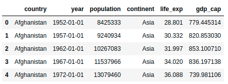
Here’s a glimpse of the data:
Data Preparation
To make our charts more informative, we need to preprocess the data. First, we will filter the dataset to include only the countries with the highest populations. The following code accomplishes this:
# Input: Data -> Grouping by country ->
# Extracting maximum values -> Sorting by population ->
# Output: List of country names
most_pop = df.groupby('country').max().reset_index().sort_values('population', ascending=False).country[:10].tolist()
most_pop >>> ['China', 'India', 'United States', 'Indonesia', 'Brazil',
'Pakistan', 'Bangladesh', 'Nigeria', 'Japan', 'Mexico']
Next, we will pivot the table using the pivot_table function, setting the year as the row index and population as the column index:
# Filter based on most populous countries
df = df[df.country.isin(most_pop)]
# Pivot the table
df_pivot = df.pivot_table(values='population', columns=['country'], index=['year'])
df_pivot.head()

Creating Animated Charts
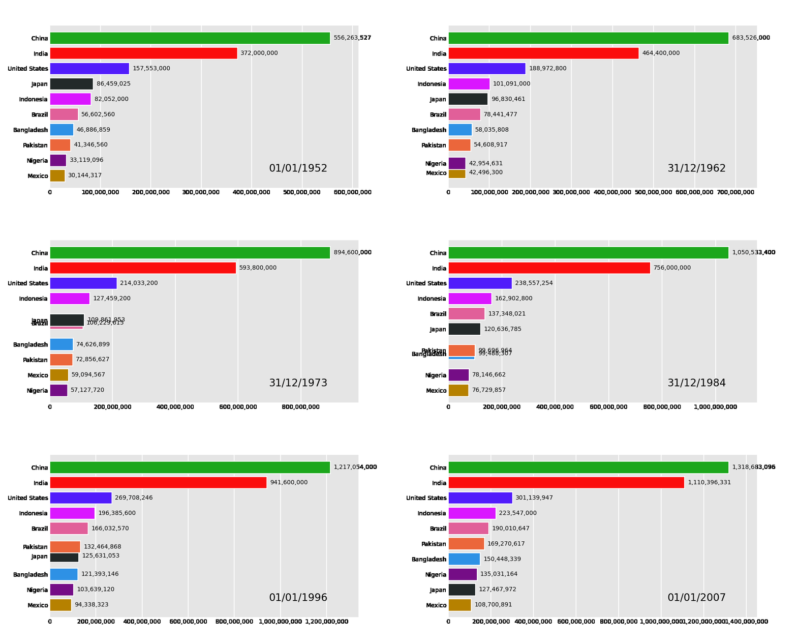
With the data prepared, we can now create animated charts. It’s straightforward! For example, to generate a bar chart, simply use this line of code:
df_pivot.plot_animated('bar-chart.gif')
And here’s the output:
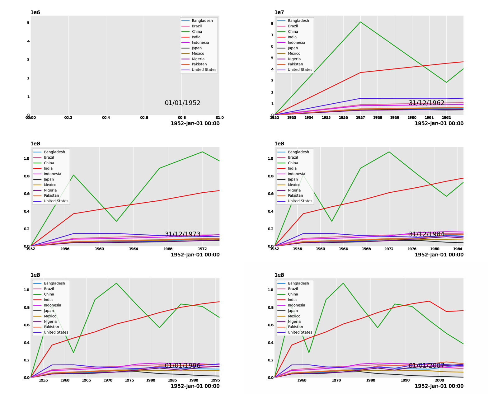
How exciting is that?! We can also create a line chart to visualize population growth. The code for that is:
df_pivot.diff().fillna(0).plot_animated('line-chart.gif', kind='line')
Check out the result:
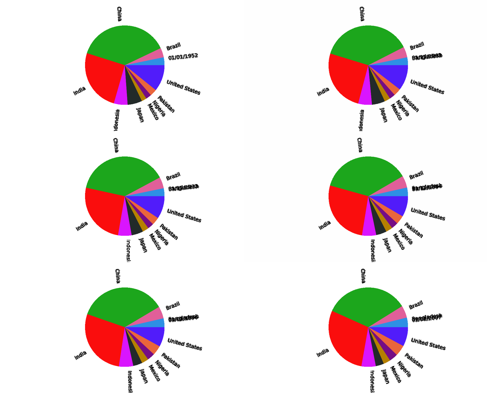
Lastly, let’s create a pie chart that rotates based on value changes. The code looks like this:
df_pivot.plot_animated('pie-chart.gif', kind='pie', rotatelabels=True)
Here’s the final output:
Visualizing Multiple Charts
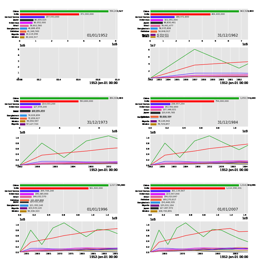
An impressive feature of the Pandas Alive library is the ability to display multiple animated charts simultaneously. To achieve this, you can generate the charts and use the animate_multiple_plots function. Here’s how:
anim_bar = df_pivot.plot_animated()
anim_line = df_pivot.diff().fillna(0).plot_animated(kind='line', period_label=False, add_legend=False)
pandas_alive.animate_multiple_plots('multi-chart-1.gif', [anim_bar, anim_line], enable_progress_bar=True)
And here’s the resulting animation:
Final Thoughts
Congratulations! You have successfully learned how to create animated charts using the Pandas Alive library. I hope this guide helps you generate impressive charts quickly and efficiently. Thank you for taking the time to read through this article!
References
Video 1: Learn to animate your Python graphs effortlessly using Matplotlib in this informative tutorial.
Video 2: This Python tutorial showcases how to animate plots using Matplotlib, enhancing your data visualization skills.