Exploring Tidal: Is It a Viable Alternative to Spotify?
Written on
Chapter 1: Introduction to Tidal
Are you considering leaving Spotify? I've recently tried Tidal, and here are my observations. Initially, Tidal struck me as a somewhat imitation app with questionable marketing strategies. However, after spending several days with it, I've discovered some noteworthy insights.

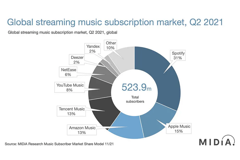
To begin with, it's essential to understand the broader context of the music subscription market. A recent article by Jon Porter on The Verge highlighted the competitive landscape, where Spotify holds over 30% of the market share, while Tidal wasn't mentioned at all. This disparity raises questions about budget limitations, particularly as I explore Tidal's offerings.
Another significant issue I faced was a “carrier hub” error during the signup process in the app.
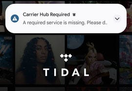
For those who aren’t tech-savvy, this could be a considerable obstacle. The Carrier Hub error seems to be linked to T-Mobile's companion app, which I couldn't install on my Google Pixel. While I wasn't entirely clear about the specifics of this error, it appeared that Tidal tries to access the Carrier Hub during signup. Fortunately, I found a simple workaround: I registered on Tidal's website first and then logged in via the app. While this solution worked for me, it could deter many potential users. Prompt action from Tidal's developers to fix this issue would be crucial for increasing their competitiveness.
Upon accessing the app, I was welcomed with a straightforward guided selection based on artists. Having switched from Pandora to Spotify previously, I couldn't recall if I encountered a similar option back then. From a technical standpoint, this method effectively "weights" the recommendation algorithm for artists and custom playlists. Artists are categorized by genre, but their tracks can also be cross-referenced with other artists and genres, leading to interesting results—like Weezer’s cover of “No Scrubs.”
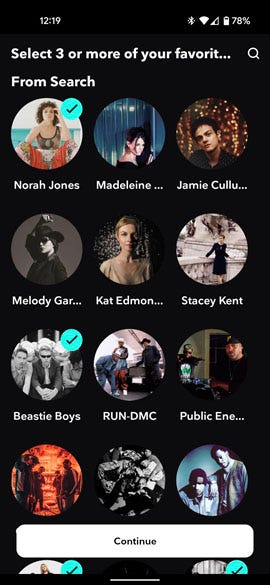
If you're not into the technicalities, don't worry. This user-friendly interface connects you to the underlying mechanisms that curate your music experience.
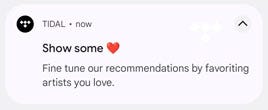
After quickly making my selections, I felt a slight panic about not being able to go back and add more. Thankfully, a push notification later reminded me how to do this, which would have been more helpful at the startup stage. If you haven't figured it out yet, it's as simple as hitting the heart icon in the menus.
Moving on to the Home Screen, I noticed it felt strikingly similar to Spotify's layout. Excluding Spotify’s extensive podcast offerings, Tidal's home screen design is remarkably akin to Spotify’s, which is why I initially referred to it as a copycat app.
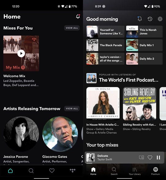
Both apps feature a main menu bar at the bottom and notifications in the top right corner, even sharing the same bell icon. The now-playing feature also has a similar sliding interface. However, subtle differences exist, particularly on the playlist page.
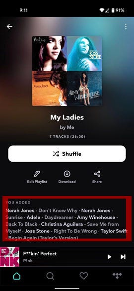
While the playlist screen appears similar, the interaction differs. In Spotify, users can edit playlists by selecting songs directly, while Tidal employs a separate edit button. If Tidal were merely copying Spotify, would they bother modifying such a minor detail? If I were a scrappy underdog competing against a major player, I might incorporate insights from their market research.
This brings to mind the question: why do we often see Burger King and Wendy’s locations near McDonald’s? If McDonald's identifies a market demand, would they ignore it? Perhaps they, like Tidal, recognize the value in adopting proven strategies.
Therefore, I argue that Tidal's approach is quite strategic. With Spotify dominating the music app sector, Tidal benefits from the extensive user interface testing that Spotify has already conducted. Mimicking Spotify's layout may provide new users with a sense of familiarity, thus easing their transition.
Furthermore, Tidal aims to attract Spotify users, representing over 30% of the market. A similar layout can help mitigate the learning curve, making it easier for new users to navigate.
You might also want to consider the sound quality aspect.
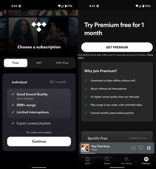
While Spotify mentions sound quality as a minor feature in their paid plans, Tidal integrates HiFi sound quality directly into their offerings. The presence of a speaker icon for adjusting sound settings is notable, as it is a core feature of their paid plans.
To provide a more in-depth perspective, I reached out to my friend Jay, who has released music on Spotify. He emphasized that Tidal's HiFi plan offers an impressive 1411 kbps, which is considered lossless quality. In contrast, Spotify's premium plan caps at around 320 kbps.
As I compare the free plans—which require a connected device—Tidal struggles with connectivity issues during my commutes through New York City's subway system, resulting in more interruptions compared to Spotify. This discrepancy hints at the different back-end technologies powering these applications.
Both apps, unfortunately, include ads that users cannot skip, which can detract from the listening experience. I often find myself inundated with ads for products I have no interest in, which only reinforces my aversion to them.
On a related note, both Tidal and Spotify request similar permissions on my Android 11 device. As an advocate for data privacy, I regularly block app permissions, and I'll reserve further analysis of this topic for another time.
In conclusion, my exploration of Tidal as a new user transitioning from Spotify has been positive. I appreciate their decision to mirror familiar screen layouts, as it reflects an intelligent business strategy. I wouldn't label Tidal as merely a copycat app; rather, it seems they aim to provide a quality alternative for music enthusiasts. With recent missteps from Spotify, Tidal has a unique opportunity to attract new users.
Chapter 2: Understanding Tidal's Unique Features
In this video, titled "Why I'm Leaving Spotify (As a Listener) After 5 Years," the creator shares their reasons for moving away from Spotify and exploring alternatives like Tidal. Their insights can help inform your own decisions regarding music streaming.
Another video, "Leave Comments on Spotify? Run Don't Walk," discusses the user experience on Spotify, highlighting areas for improvement and offering a critique of its functionality.